
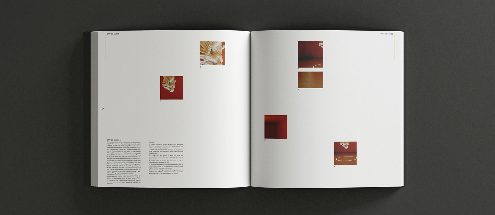
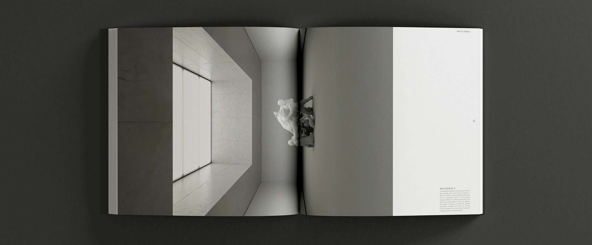
Modern Renaissance
Modern Renaissance is a publication exhibiting a set of images exploring the combination of Renaissance Art and Hellenistic Sculpture in a modern and minimalistic setting. These images have been designed deliberately to transform the aesthetic intention of the beautiful originals, in an attempt to communicate an entirely new feeling and allow viewers to partake in a new experience.
With no client and no brief, this project at its core, is a personal and visual explanation of my current design journey. I have chosen to explore this use of content contrast by designing modern environments in 3D, focusing on clean, simplistic architecture, intriguing lighting, purposeful texturing and unconventional subject placement. This publication marks the end of a chapter in my creative career, finishing my degree and venturing off into the professional word of Communication Design. These set of images in a way conceptually demonstrates my current style of design that I implement throughout all of my work; simplicity, deliberate contrast, bold colour, and photographic inspired composition.
The publication is designed as a coffee table book, created on a 12in x 12in square layout, designed with the intention for leaving open on one of the large image spreads. I have utilized the skills I obtained during my time studying publication design with Stuart Geddes, focusing on a clear marriage of content and design. Concentrating on showcasing these images in an appropriate and truthful way, letting the images dominate the space and unobtrusively designing the excess information about the images if the reader so wishes to dive deeper.


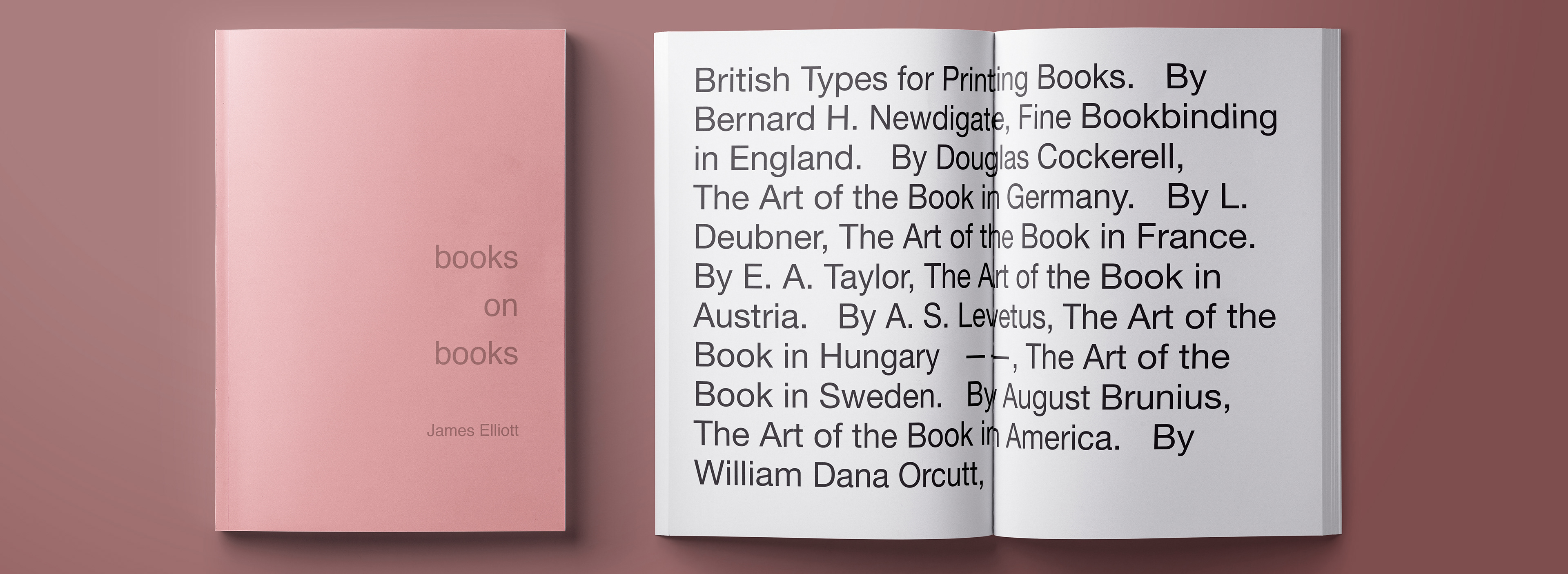
Books on books
Books on Books was created as an 'Opinionated Encyclopaedia' project. James curated multiple different texts that talk about what a book is from different countries around the world. With multiple outlooks from different authors about what a book is from so many different countries, after completion it leaves the reader to make up their own mind about what a book is to them.
Too pare with the magnificent writing from multiple authors, James photographed pages from some of the rarest books in the National Gallery of Victoria's (NGV) book collection and pared them with their corresponding countries to each section of text. The end result is a beautiful and elegant modern novel, filled with great content and amazing photographs of some of the best and rarest books out there.


80 Dinners around the world
This is a Magazine book designed by James Elliott. The book is about the best restaurants in the world, so James chose to honour the elite sense of the restaurants by creating this book in a very modern and simple aesthetic way. Using a two paragraph grid with a classic serif body font type face and a bolder more modern san serif header font. James uses a very simple clean two tone complimentary colour scheme for the whole magazine to keep the aesthetic consistent throughout. It is clean and easy to read and perfect for there audience the the book is aimed at.


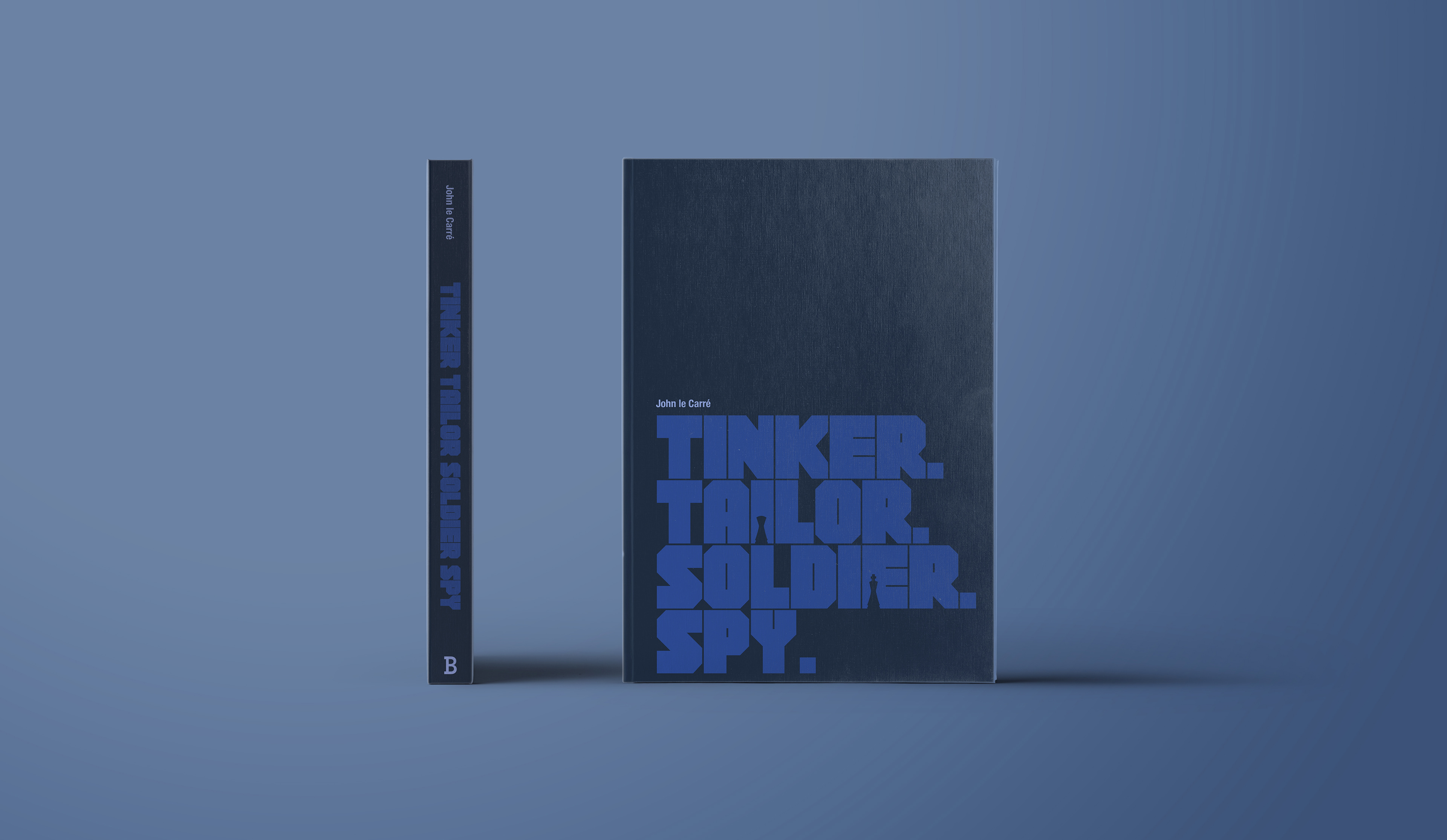
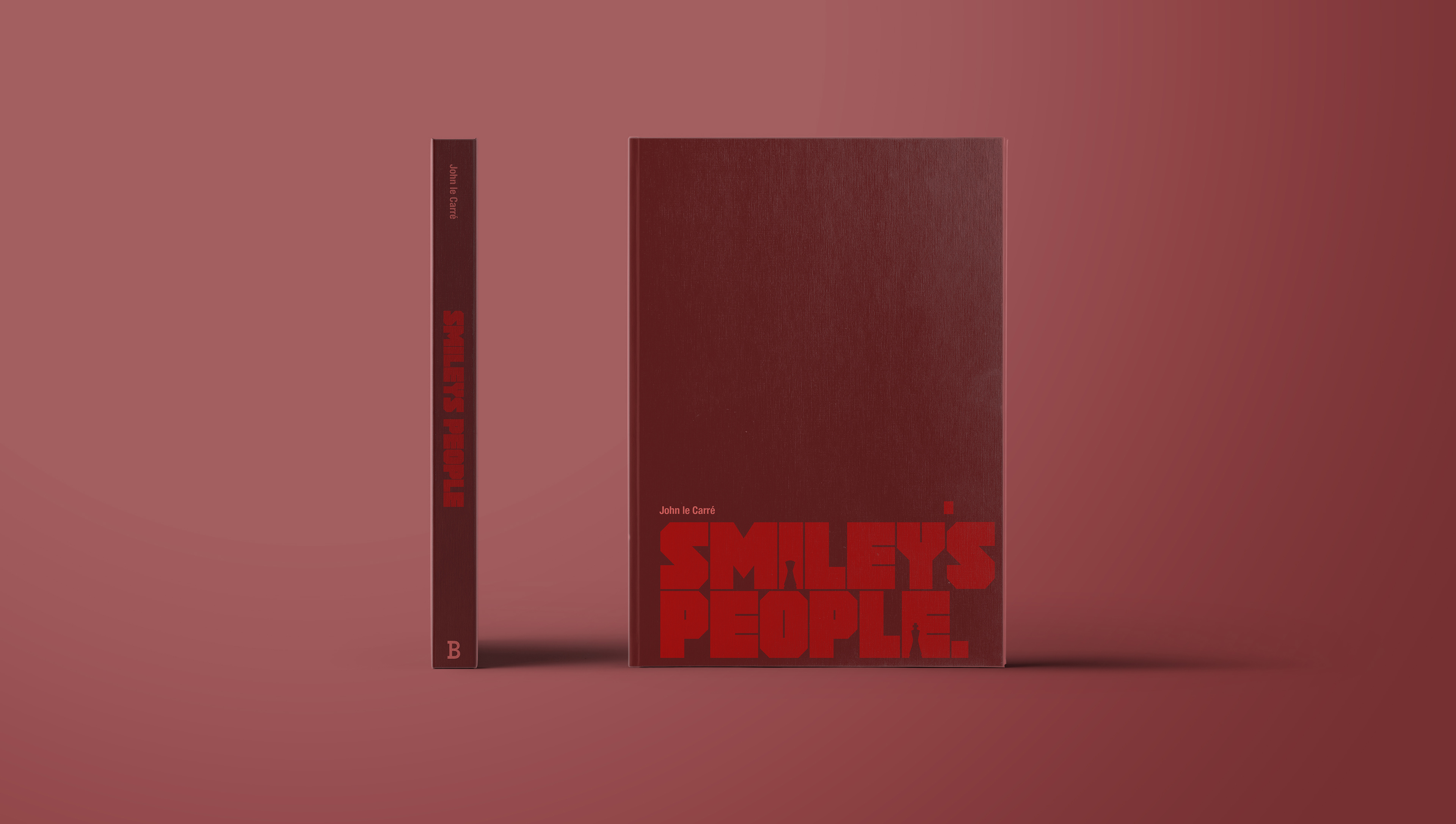
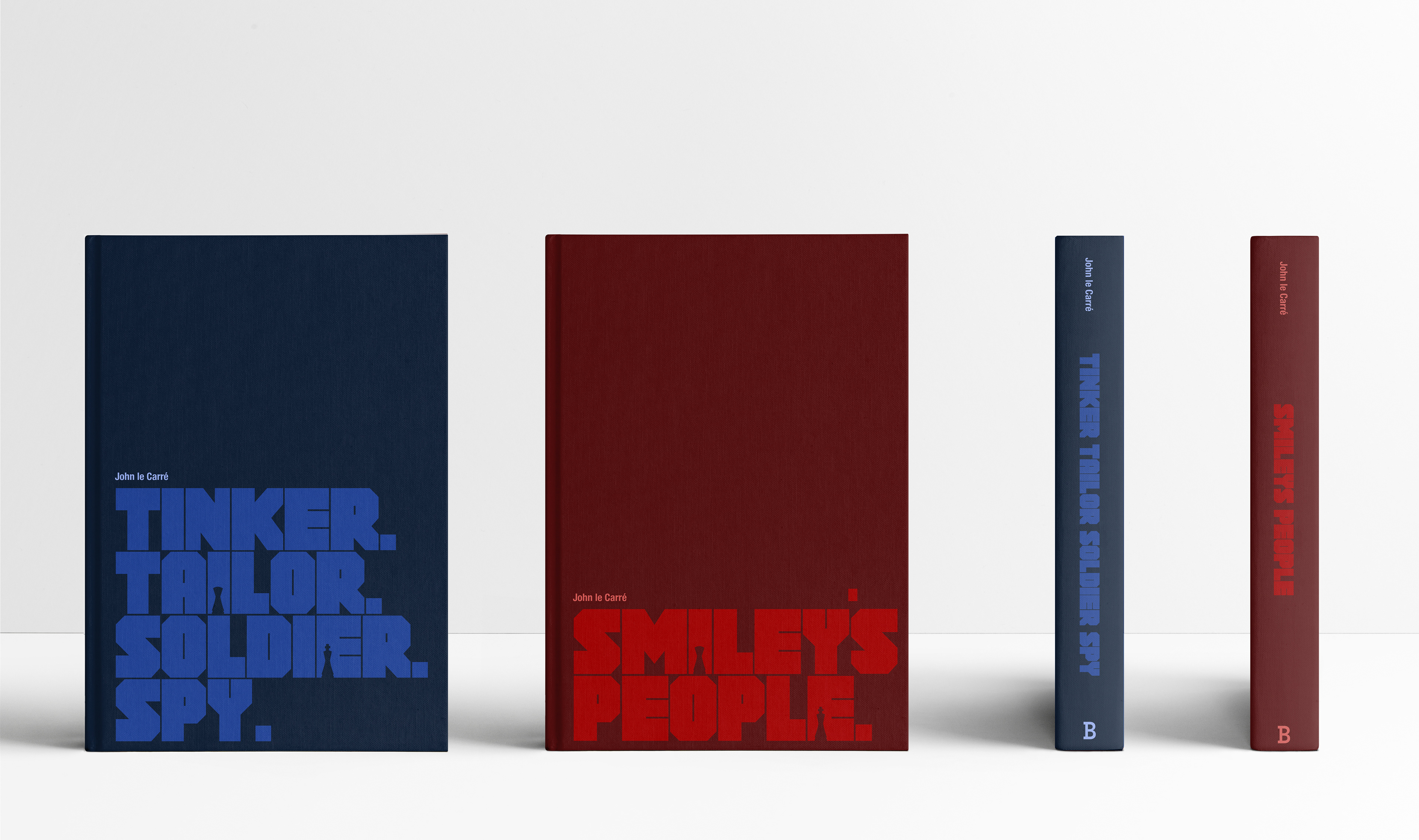
John le Carre Book series Re-Design
For this project I set off to create a modern and contemporary cover design for two classic novels by the spy master John le Carré. Both books are written with complex and subtle detail, with close attention paid to the intricacies and moments of surprise. They are books that generate thought and induce tension in the reader.
I chose to honor this by designing a simple, modern cover, with strong negative space and smaller refined details throughout. Both books are described by John himself as a ‘game,’ more specifically a chess match. I wanted to feature this theme by incorporating chess pieces throughout both designs
I had two outcomes in mind with my choice of typography, which is a Super Bold, Condensed font named BOB. Firstly to reflect the high tension theme which occurs throughout both novels, and secondly to have a structure that resembles a maze, to honor the cold war’s ‘Game’ like nature.
The colours I chose to use were a monocromatic contrasting blue and red, which resemble both sides of the story, the British and the Soviet Union.
A strong modern composition, with subtle and relevant elements throughout, this modern redesign has captured just enough to entice new readers, without giving anything away, leaving the reader to experience the joy of Johns writing purely from the words himself.

Binding Nomination small Poster
This is a small A5 design created for the Magazine 'SUPER'. James used loud colours and strong contrasting elements, as well as a more alternative layout of text, to break the usual boring style of any business document normally created. This is a fun to look at and enticing to read document because of the playful style that it has been designed, which is the effect he wanted to create.

Fine art Magazine
This is a series of images taken by some of the worlds most talented photographers which have been arranged in an alternative, yet simple and modern layout. (One page of 3 Shown)
