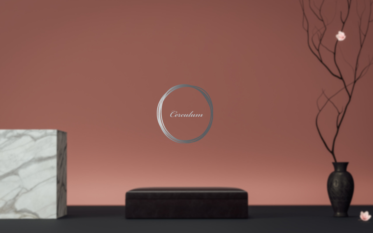
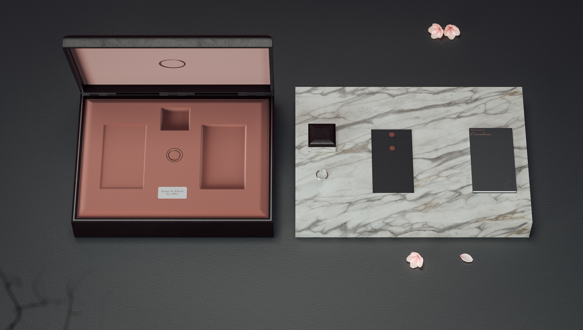
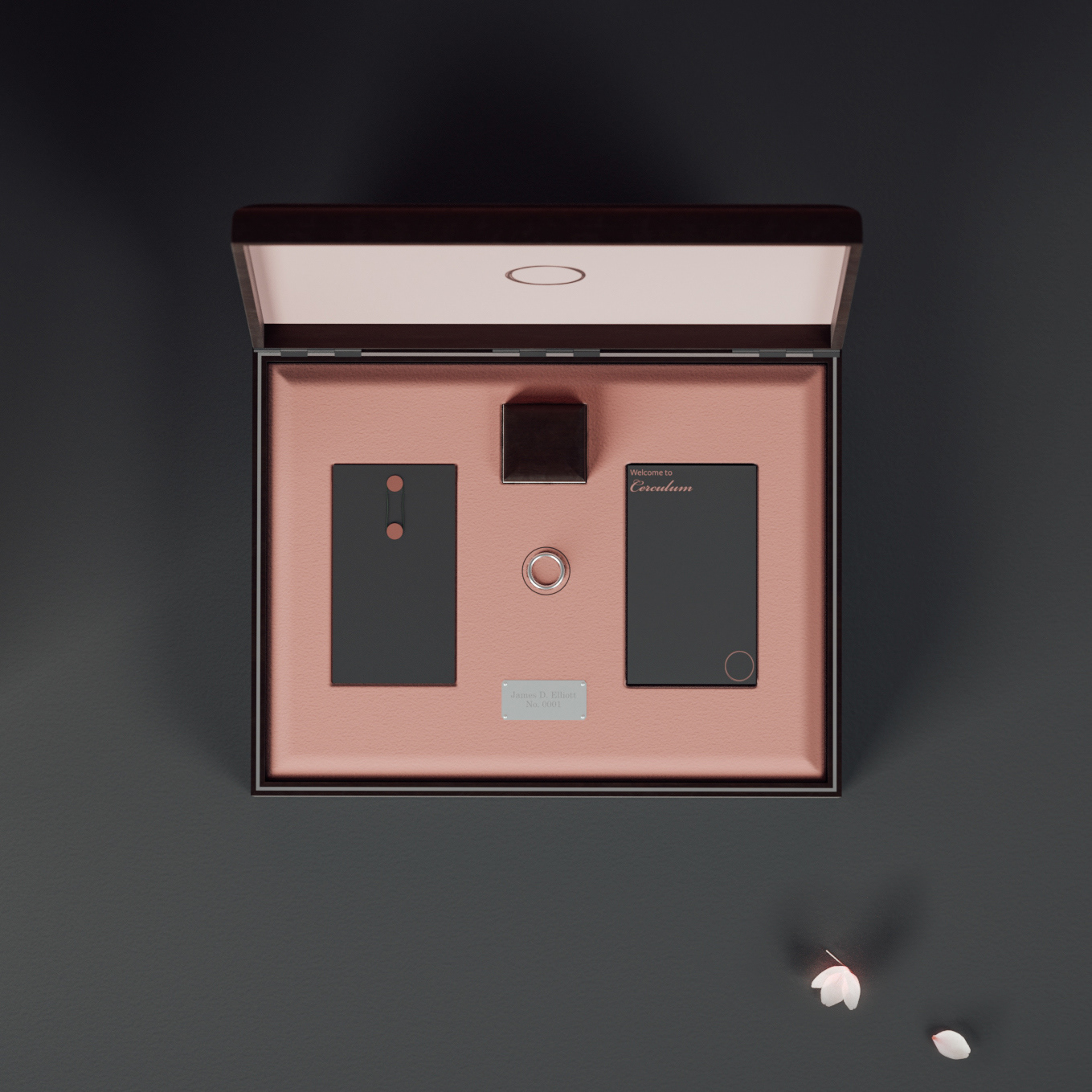
Circulum
For this project I set out to design super exclusive, high end packaging, for a wearable technology brand. I created Cerculum by merging a few already existing brands and products together. Cerculum is an ultra-expensive, invite only scan ring and ‘club’ that is only whispered about through the general public. It was evident from the beginning that I would not be able to use a traditional mock-up for this product as it has such an extreme price tag and exclusive clientele. So I decided to 3D Model, texture, light and render the packaging in a program called Blender. I chose to design a clean, detail-oriented packaging box, utilizing super rare and expensive materials, taking inspiration from the likes of Rolex and Rolls Royce.
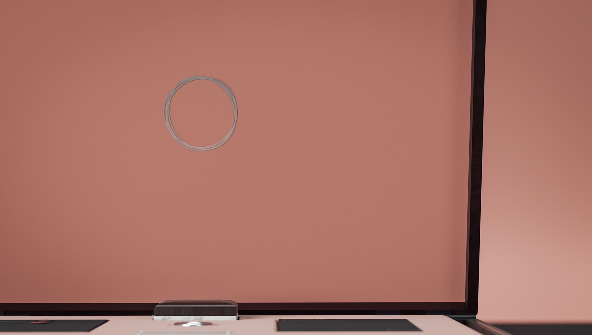
For the branding I chose to design two separate devices. The first was a hero illustration called the Cerculum Rings, this logo would be the face of the company, elusive and indecisive, only those that have actually brought the product will see this pared with the second device, the name of the brand.


Moma party in the garden Branding
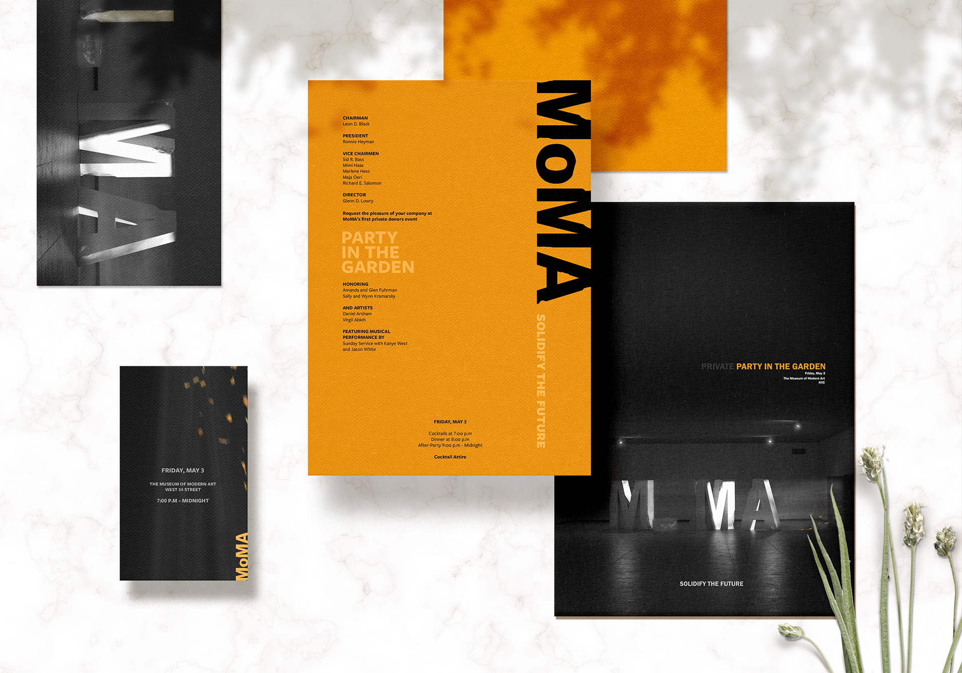
For this branding concept the goal was to create an experimental branding strategy to entice donors to attend MoMA's annual fund raising party. Due to COVID-19 this donors event is more important then ever, requiring more exclusive and important donors to attend and invest in order to ensure MoMA solidifies their future as one of the most influential Modern Art Museums in the world.
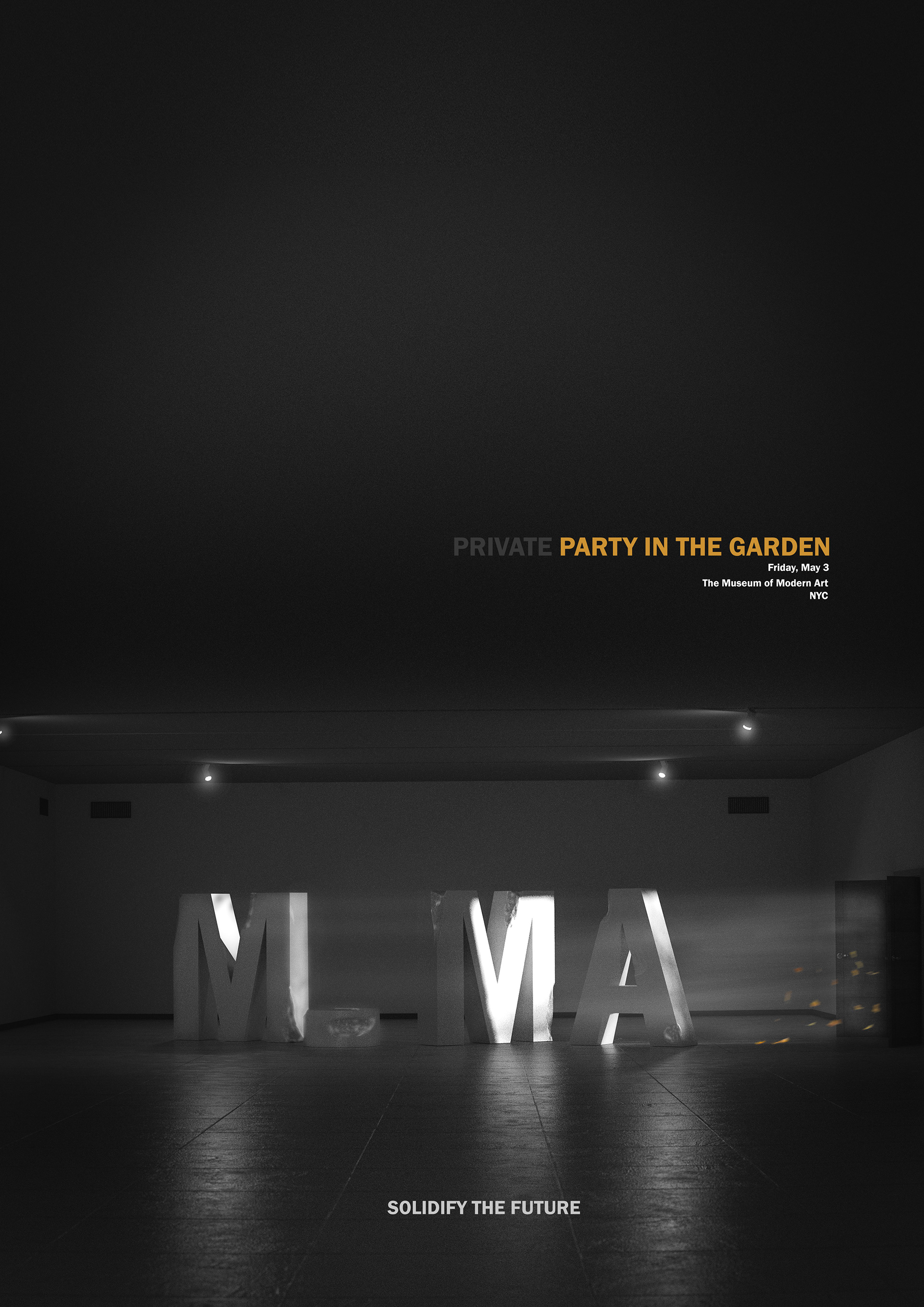
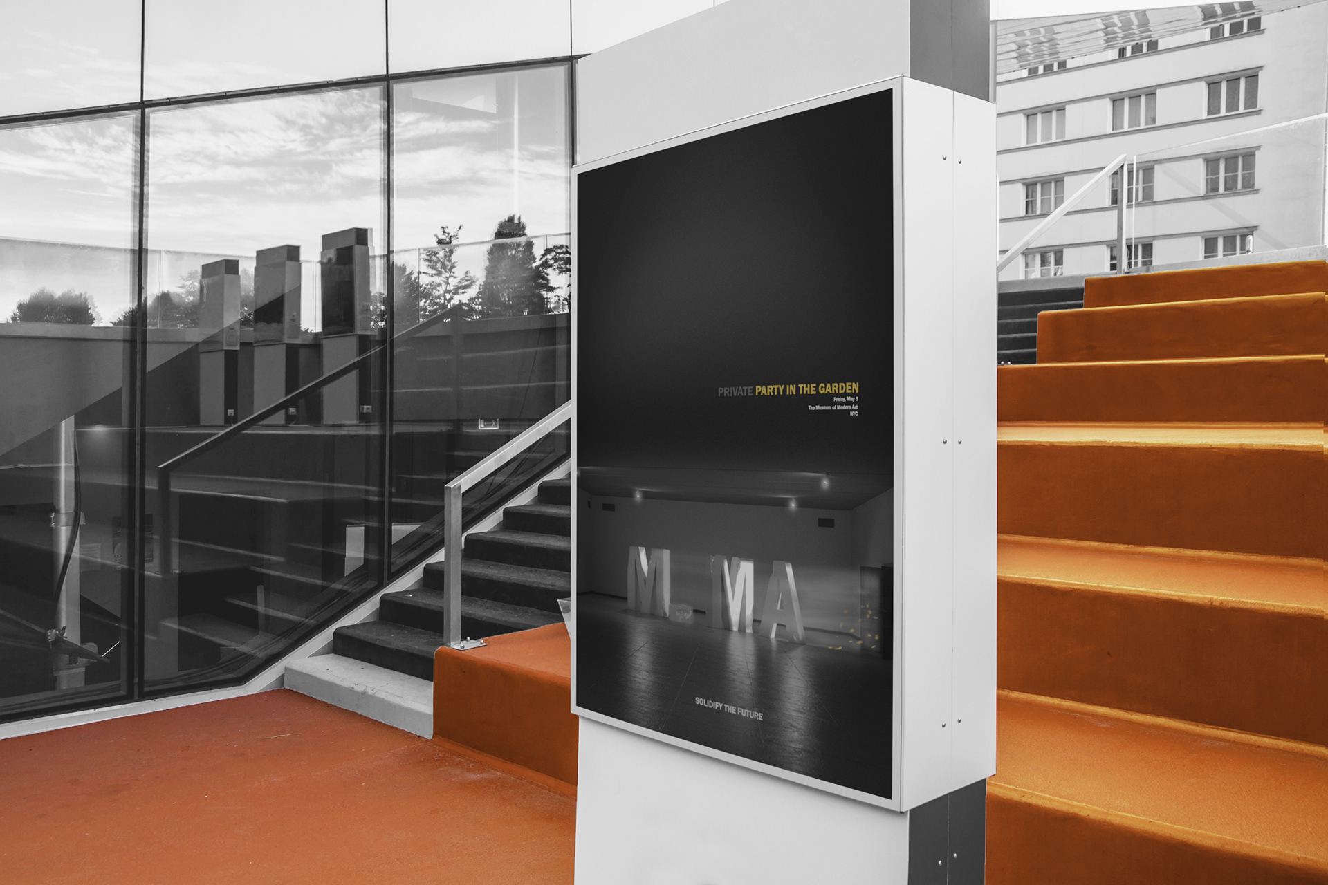
This poster design if the focal point of the branding for the entire event. Inspired by the exhibition photography by Pier 24, this image places the viewer inside the MoMA exhibition space, grounding the viewer as well as making them feel as though they are the only ones there. This is important as the target audience for this event value exclusivity, they want to feel like they are the most important person in the room, and making them feel as though they are the only person there achieves this, increasing the chances of their attendance ever so slightly.
In the middle of the image is a crumpling stone sculpture influenced by Daniel Arsham’s works. This experimental stone sculpture is the center piece for the party, depicting MoMA in a more fragile state, crumpling around the edges yet still standing and still beautiful. This was designed to show MoMAs current economic state, in need of assistance from donors, this sculpture hints to this but still shines light on the beauty of the company, and showing that they will still stand strong regardless of obstacles that they face, which is important information for the donors when deciding to invest large sums of money into the company.
This invitation package will be sent physically to those invited, and contains a few separate artifacts. The folder displays the hero poster image with the Daniel Arsham inspired sculpture and basic information text. This is designed to peak the interest of those receiving the package. Inside the information for the event is located on an A4 sheet, this bright orange design has been implemented to quickly grab the attention of the recipient, and convey the important information quickly, Who What When and Where.


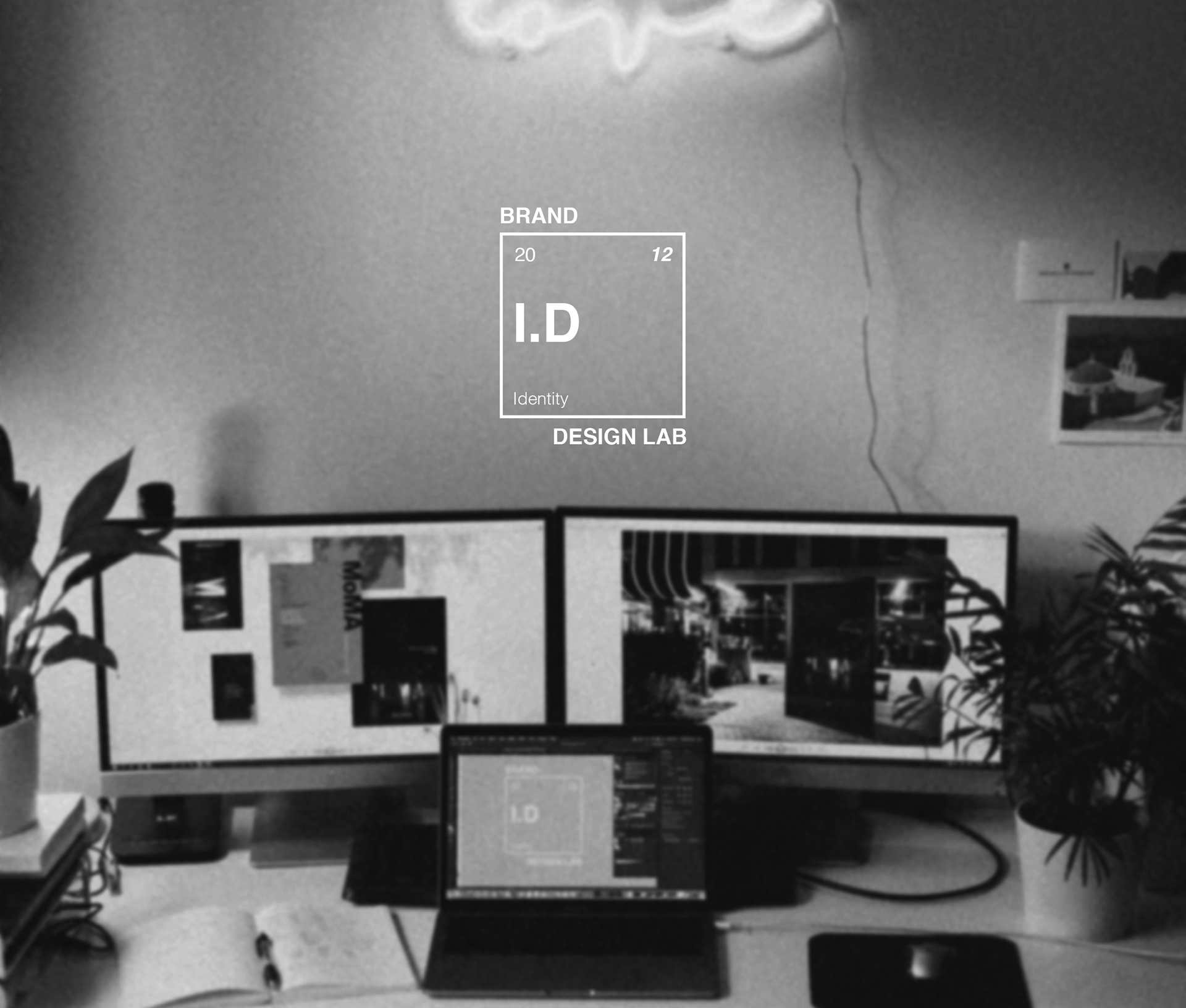
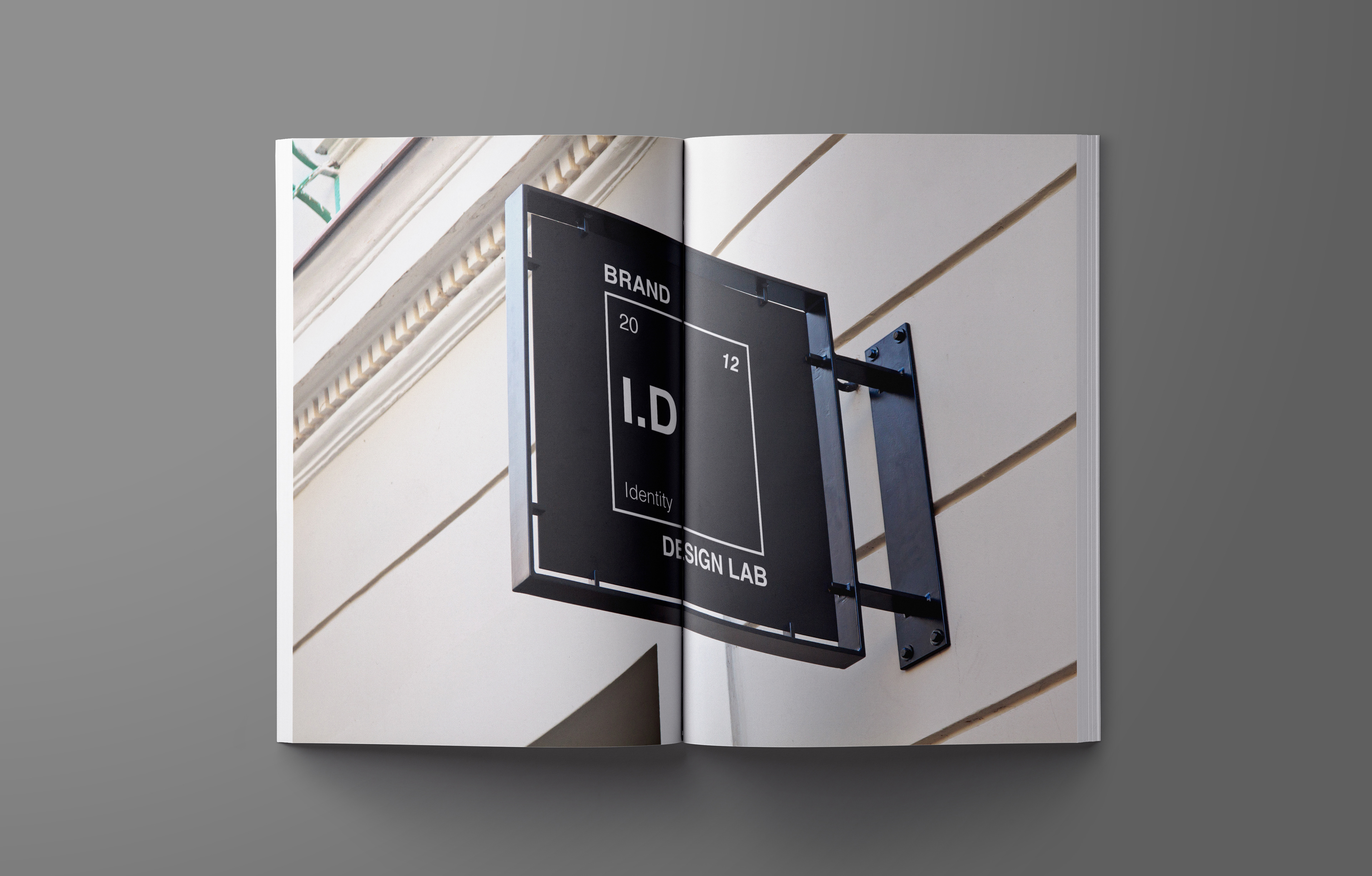
Brand I.D Design Lab
This Branding redesign was for an experimental branding studio which focuses on pushing the boundaries and incorporating a studio wide collaborative system.
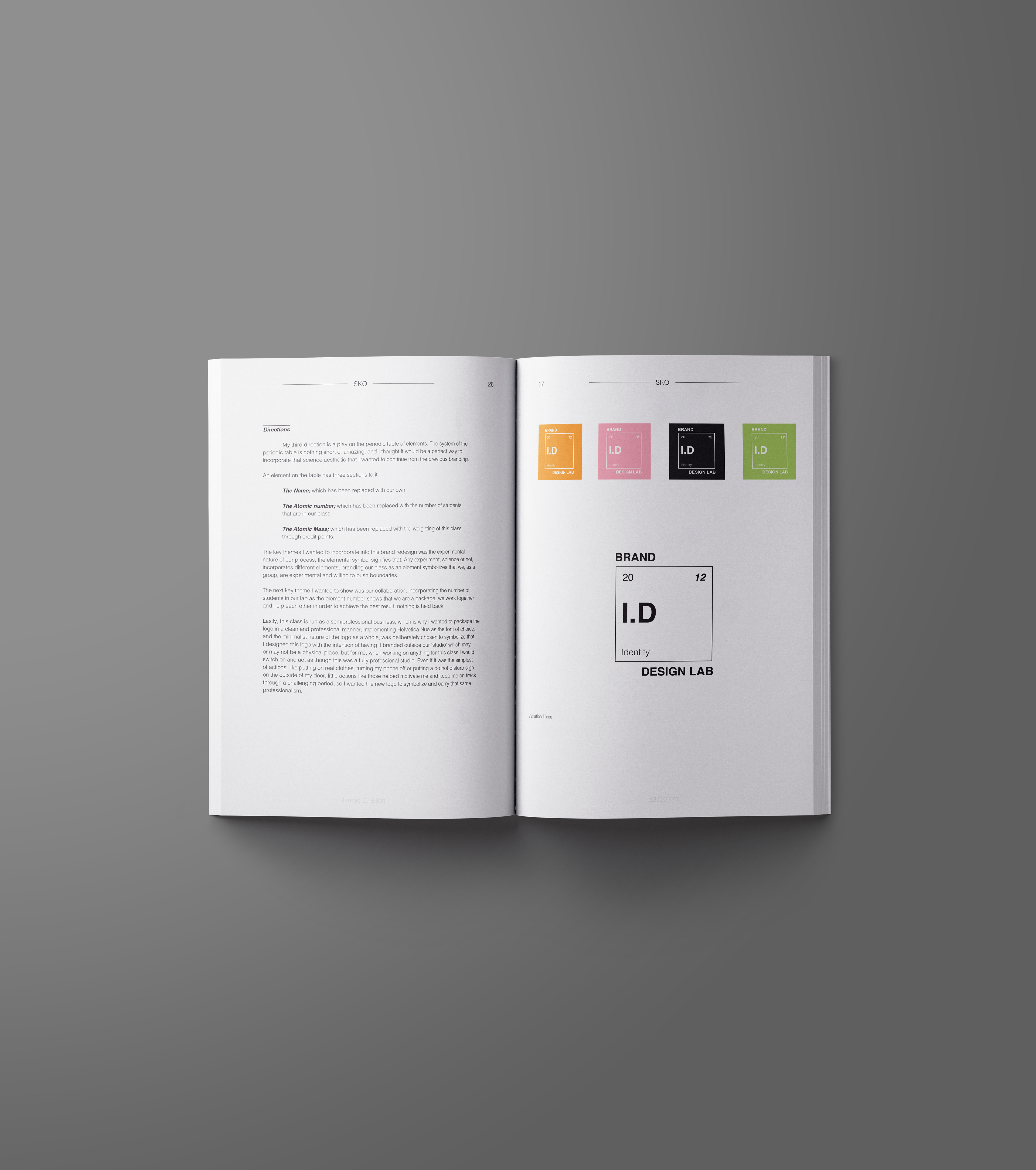
The key theme surrounding this brand redesign was to incorporate the experimental nature of the studios process. The elemental symbol signifies that, any experiment, science or not, incorporates different elements, branding this studio as an element symbolizes that the studio, as a group, are experimental and willing to push boundaries.
The second key theme that needed to be incorporated was an element to visualise collaboration. Incorporating the number of attendees in the lab as the element number shows that they are a package, they work together and help each other in order to achieve the best result, nothing is held back.
Lastly, this studio is run as a semiprofessional business, which is why the logo is packaged in a clean and professional manner, implementing Helvetica Nue as the font of choice, and the minimalist nature of the logo as a whole, was deliberately chosen to symbolize that.